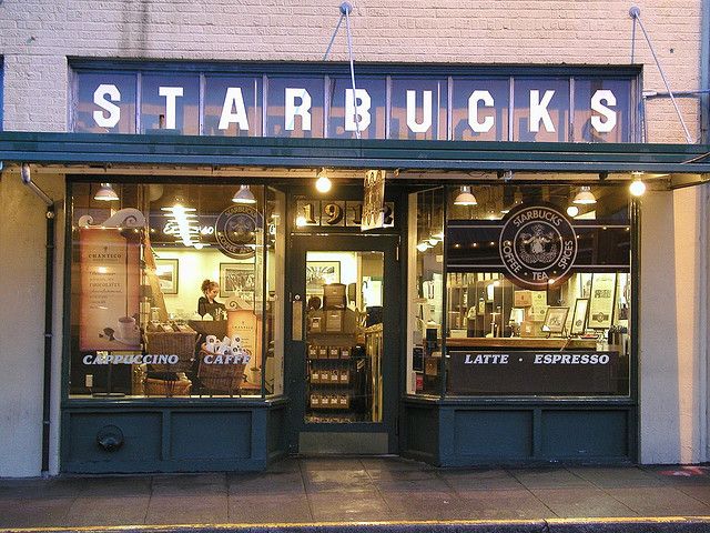
What is the deal with the Starbucks logo?
We’re not the first person to ask this question. Starbucks’ (2021) brand mission is “To inspire and nurture the human spirit – one person, one cup and one neighborhood at a time. Despite being a wildly successful brand with revenue of over 6.19 billion in 2019, the Starbucks logo does not immediately convey the values or mission of the brand. In fact, many people are confused about what the logo is, a twin-tailed mermaid, and what it represents. Starbucks itself realized this issue and wrote a blog about its logo in 2016 where it explained who the siren is.
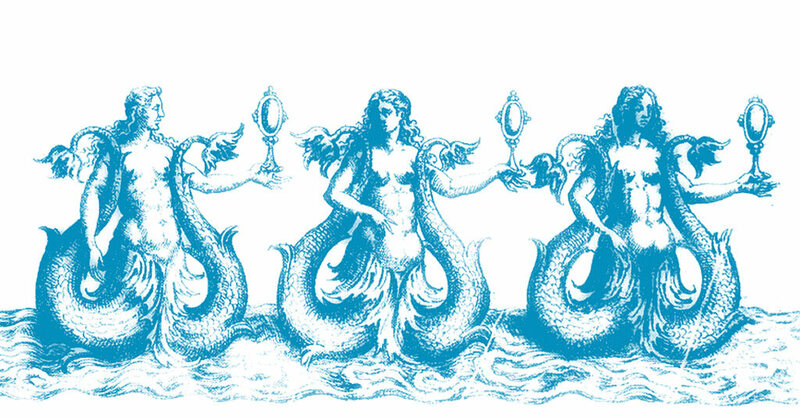
Starbucks’s name is a reference from the novel, Moby Dick. Then, the founders were attracted to a photo of a Norse woodcutting of a twin-tailed siren from an old marine book and decided to use a similar image as their logo. San Francisco, the Starbucks headquarters and founding city is also a port city and coffee often travels across the ocean (Flandreau, 2016). These factors helped to shape the logo and the branding of Starbucks.

Creative Director Steve Murray says “It’s definitely about coffee but it’s about a lot more than coffee. It’s about…being good to people, being good to the world.” This may not have been immediately apparent to consumers, which is why Starbucks initially had “Starbuck, Coffee, Tea, Spices,” on its brown logo until 1992 when they reduced it to just “Starbucks, and “coffee,” and changed the logo to a green shade. In 2011, a rebrand took the words off of the logo leaving just the now-iconic siren.
Starbucks took a large risk in building their brand with other factors like quality, excellence in service, supply chain care, employee benefits, commitment to sustainability, and ambiance in their shops (Starbucks, 2020). Based on the logo alone, Starbucks may have failed in initial branding, but they got one thing right, brand recognition. Wheeler (2019) states, “Brand awareness and recognition are facilitated by a visual identity that is easy to remember and immediately recognizable. Visual identity triggers perceptions and unlocks associations of the brand.” Starbucks took a chance with a unique and memorable logo, but in the end, it became very iconic and representative of its brand.
Starbucks could have chosen to use a descriptive name as Wheeler (2019) suggests. This would have told consumers immediately what the company does or produces. This method of branding would also help new consumers who may not yet be familiar with the brand, to understand the brand’s intent. Starbucks, alternatively, was named after a character in a novel and initially, Starbucks had to add its industry wording to its logo until its brand became recognizable enough. Starbucks did employ another one of Wheeler’s (2019) recommendations to make its name unique, easy to say, and spell. The name has no “magic” spelling and is nearly phonetic. This ensures consumers can remember the name as well as easily research it if necessary.
While Starbucks didn’t completely fail at its logo, it did take some unconventional liberties by not representing its product with a pictorial element of the product itself. Starbucks was lucky that its other branding was so strong, as they now have an iconic logo and highly recognizable brand, partially due to their unique and easy-to-remember name and color, as well as their well-known values.
References
Flandreau, M. (2016). Starbucks. Retrieved March 15, 2021, from https://stories.starbucks.com/stories/2016/who-is-starbucks-siren/
Lock, P., & 1, M. (2021, March 01). Starbucks revenue worldwide 2019. Retrieved March 15, 2021, from https://www.statista.com/statistics/266466/net-revenue-of-the-starbucks-corporation-worldwide/
Starbucks. (2021). Company Information. Retrieved March 14, 2020, from https://www.starbucks.com/about-us/company-information
Wheeler, A. (2018). Designing brand identity an essential guide for the whole branding team. In Designing brand identity an essential guide for the whole branding team (5th ed., p. 140). Hoboken, NJ: Wiley.
